Marketing
3 critical website updates for better UX
Randi Mohr , vice president of customer success and marketing at Whereoware, shares why marketers must analyze all aspects of a website's performance and continually strive to enhance each customer's experience. Improving website user experience is a continuous process, as technology, product interests, and consumer behavior is always evolving.
April 9, 2021 by Randi Amorusi — VP of Client Success and Marketing, Whereoware
 ChatGPT
 Grok
Grok Perplexity
 Claude
Today's customers expect flawless web experiences. In fact, in a survey of more than 8,000 B2C and B2B buyers worldwide, 73% said just one really good experience with a company raises their expectations of other companies.
To meet these high expectations, marketers must analyze all aspects of their website's performance and work tirelessly to enhance each customer's experience.
Improving website user experience is a continuous process, as technology, product interests, and consumer behavior is always evolving.
To get UX right requires understanding your customers, their motivations and preferences, and how they interact with your website and digital campaigns. These insights are used to reduce friction, improve clarity, and help customers complete actions to satisfy their desires and goals.
Getting UX wrong has dire consequences — a single bad web experience makes visitors 88% less likely to return. To help you maximize effort and focus on quick wins, here are three critical website optimizations to improve user experience and drive conversions and revenue.
1. Make it easy to find products: Streamline navigation
The best online experiences make it easy to find products and information. In fact, 56% of customers expect to find whatever they need from a company in three clicks or less.
Your website's navigation is the primary real estate for visitors to find what they're seeking and take a desired action. The top navigation should be concise, logical, and descriptive and include high level categories to organize items of interest.
We typically recommend you limit the top navigation to fewer than seven categories to minimize cognitive load and maximize usability, and use a dropdown sub-navigation to break product categories down further. Enhance the sub-navigation with product imagery and messaging to capture attention and guide the next step. Base category names on keyword research and language common to your audience to ensure the options are intuitive and recognizable at-a-glance.
Reduce frustration and abandonment by ensuring your website is easy to navigate and guiding customers to explore your website further.
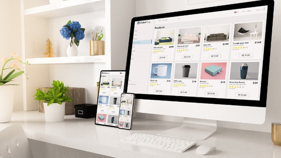
2. Motivate purchases: Enhance product detail pages
Collectively, product detail pages (PDPs) are arguably one of the most critical aspects of your e-commerce website. An optimized PDP uses a combination of high quality product photography; compelling descriptions, specifications, and details; and interactive elements to turn browsers into buyers and drive revenue.
Product detail pages should anticipate buyers' questions and provides helpful information and content to educate the buyer and motivate conversions. The best PDPs entice buyers to engage with the brand. For example, our client Cuisinart's PDP uses rich media, reviews, social buttons, linked logos to Find a Retailer, and Recipes to engage buyers and help them visualize cooking with the products.
The best web experiences are personal, and AI-driven product recommendations are one way personalize the PDP buying experience. Product recommendations can use website interactions (such as order history) visitor profiles, and intelligent algorithms to serve up the right products to the right person. Even better? These algorithms continuously analyze actions and results, getting smarter over time and more likely to return the most compelling items.
Adding product recommendations to your product detail page aids product discovery, while increasing average order value.
3. Reduce abandonment: Simplify the checkout process
You're almost to the finish line! Your customer successfully navigated through your website, arrived on a product detail page that convinced them to add-to-cart, and now, the urgency to convert is high.
The shopping cart process is a crucial step in the buying journey and prone for abandonment. Statista found that 88% of online shopping orders were abandoned.
To reduce abandonment, the shopping cart process must be simple, straightforward, clear, and compelling. Include an order summary with product thumbnails, titles, quantities, and prices to ensure the customer knows exactly what they're buying. Shipping, taxes, and other necessary information should be clear and transparent, so there are no surprises.
Try to streamline the cart into as few steps and fields as possible. Autofill known information, like the customer's address and billing information, to reduce manual entry. If possible, put the checkout button both at the top and bottom of the page, or make it sticky, so it's always visible and easy to find.
Consider adding consumer-friendly payment methods, like PayPal or Apple Pay, and popular security seals, like Verisign and BizRate, to make it easier to buy and put shoppers at ease.
The combination of clear information, simple steps, and compelling visuals work together to capture the sale.
Better UX drives customer acquisition and loyalty
Your website gives customers an immediate impression of your business and is a vital sales channel for growth in 2021. By improving your website navigation, product detail pages and cart, you are optimizing the customer journey and setting a foundation for increased engagement and revenue.
Randi Mohr is vice president of customer success and marketing at Whereoware
About Randi Amorusi
Related Media
Subscribe
Get the latest news and resources from Retail Customer Experience.