Marketing
Target’s dealworthy: Why it's not hitting the right notes
Target has launched a new owned brand, dealworthy — a discount in-house brand. An obvious response to the current drop in spending resulting from more recent inflationary pressures on today's consumers.
May 15, 2024 by Stefan Hajek — ECD, Designit
 ChatGPT
 Grok
Grok Perplexity
 Claude
Somewhere around four decades ago, as the U.S. was experiencing high inflation, a phenomenon of grocery chains creating their own generic products began. The trend of stark white labels and big black text lifted from French supermarket chain, Carrefour's, caught on. Not only was the packaging less expensive and faster to make, but it clearly communicated the cheaper cost and were easy to find.
Flash forward to 2024 during which time Target has launched a new owned brand, dealworthy — a discount in-house brand. An obvious response to the current drop in spending resulting from more recent inflationary pressures on today's consumers.
But while the move makes a certain amount of sense, the way the retailer is telling the dealworthy story is not hitting the right notes. At worst the branding is a disaster, a disappointment at best.
Missing the target
Target's sweet spot has been that it's not high-end, while also not as cheap and cheerful as a WalMart or Kmart. But with the creation of dealworthy, the retailer is just dragging its brand down into the bargain basement. And unfortunately, consumer perception has a way of becoming reality.
But this isn't the most troubling part. The real problem is the brand's identity itself. From the name to the packaging, it's nothing short of an unmitigated disaster.
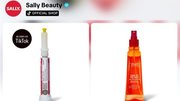
Is the stark packaging meant to be a throwback to the generic packaging of the 70s/80s? I don't know, but some trends aren't worth reviving - like parachute pants or mullets.
And the name dealworthy is so on the nose and uninspired. Regardless, it all screams CHEAP, which might be the point, but does it need to be so loud and obvious?
Expect the expected
Target has always expressed that design is part of its DNA. Its website reads that "design means taking the expected and making it extraordinary." Previously, it has lived up to this standard with elegant and attractive owned brands like Good & Gather, Cloud Island, and Everspring. Solid naming. Intentional color stories. Unique visual language. The problem is that everything about dealworthy is expected and ordinary.
Minimalism is a respectable design approach, and a restrained aesthetic can carry the day when it's properly applied, but the dealworthy packaging is not minimal. It's simply uninspired - and not attractive.
That's not saying it's ugly, which is arguable — but it isn't drawing the interest of the audience. And that's a major problem.
Stacking this brand against the other owned brands in the Target portfolio easily demonstrates how dealworthy cuts into the retailer's brand narrative of value over cheapness. Some consumers won't miss a beat because the bargain is the pursuit. But to Target (or any brand) I'd say just because you're offering discounted products doesn't mean your identity should look cheap.
About Stefan Hajek
Stefan is currently leading the creative teams of the Designit Americas Brand and Marketing division. Building culture, process, and growth throughout; elevating creative as a practice; leading new business opportunities; overseeing client work and relationships; and infusing purpose in work, through a creative lens.
Related Media
Subscribe
Get the latest news and resources from Retail Customer Experience.