Article
Gap on new logo: Never mind
The retailer quickly backpedaled on its new logo design after customer furor. Was it all just a PR stunt?

October 19, 2010
What follows is an excerpt from one of RetailWire's recent online discussions featuring commentary from its "BrainTrust" panel of retail industry experts.
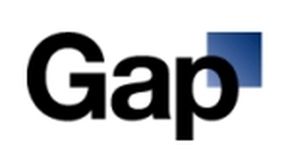
An Oct. 8 poll of RetailWire readers found that 54 percent thought Gap Inc. made a mistake when it decided to dump its old logo in favor of a new one. As it turns out, Gap management came to the same conclusion and is going back to the original.
The retailer came under intense criticism after the new logo was unveiled early this month and announced that it might make changes after going the crowdsourcing route. That too, the chain decided, was a mistake.
"We've learned a lot in this process. And we are clear that we did not go about this in the right way. We recognize that we missed the opportunity to engage with the online community. This wasn't the right project at the right time for crowd sourcing," Marka Hansen, president of Gap North America, said in a statement. "There may be a time to evolve our logo, but if and when that time comes, we'll handle it in a different way."
Gap's management has come under criticism for how it handled the new logo launch and its subsequent decision to go back to the original.
"Management, in my humble opinion, should not have tapped instantly into the world of social networking to gather feedback on the logo alteration before it was out there for a few months. I think management should have been management, meaning launch the new logo, put it on the shopping bags, in store, online signage, and on the airwaves," wrote Brian Sozzi, an analyst with Wall Street Strategies, in a research note. "By the end of the holiday season I fancy many consumers would have reacted positively to the new Gap, maybe perhaps forgetting what the old logo was altogether. It's nice to have social media to accumulate intelligence, but if management would have put the revised logo out there, executed upon the delivery to consumers, I think the outcome would have been much different."
Discussion Question: What lessons are there to be learned about managing brands in the era of social media based on the Gap experience?
So Gap creates a new logo, releases it in a few places, draws significant flak, claims that it is a work in progress and invites consumers to submit their own logo designs. In the process, they garner millions of dollars in free PR and make people think about Gap. What can be wrong with that? - Max Goldberg, founding partner, The Radical Clarity Group
The Gap Logo probably needed to be modernized ... and a crowdsourcing project is au courant, if nothing else. But it seems to me that continuity of the brand's equity would be better achieved through a sharp design house and traditional consumer testing. Call me old fashioned. - Liz Crawford, SVP, MARS Advertising
Nothing wrong with freshening up the logo along with the stores, especially for a fashion brand. I am surprised the last one lasted 20 years. The only thing I find a bit peculiar is the wishy-washy "send us your designs" element after they released it. If they are that sensitive to the feedback, then why not go the crowdsource route from the start? - Paul Schottmiller, director, Retail/Consumer Products, Cisco Systems Inc.
Gap blew it. The logo that they tossed was as iconic as the Nike swoosh. Some think it was an ingenious mastermind strategy to create buzz. I think it was a misguided group decision that has blurred the brand's identity and confused its core customer even more. The old saying rings true here: 'If it ain't broke, don't fix it.' In Gap's case, there's plenty that needs fixing and this logo fiasco is an unfortunate distraction. - Marge Laney, president, Alert Technologies Inc.
Gap has to remember that a logo needs to function on several different levels simultaneously. A logo has to register the brand name on sight, reflect the brand's image, reinforce existing and future strategies, and distinguish the brand from the competitive landscape. The logo has to appeal to customers (never mind the part of fax well).
These are just some criteria for an effective logo. In the long run, an effective logo should have an ownable look that creates recognition from a distance.
These criteria are measurable. We're all wondering if GAP made the effort. - Joan Treistman, president, The Treistman Group LLC
| What do you think of the Gap logo drama? Continue the conversation in the comments below! |
 ChatGPT
 Grok
Grok Perplexity
 Claude


