News
COVER: Telling the story with color
Designer and television host Christopher Lowell on how retail design and the colors it uses communicate a narrative and build a shopping experience.
November 2, 2008 by James Bickers — Editor, Networld Alliance
 ChatGPT
 Grok
Grok Perplexity
 Claude
 In the philosophy of designer, author and Emmy-winning television host Christopher Lowell, there are seven "layers of design" for any physical space. The first layer, which must be tackled before any other issues - what goes into the design, how it is laid out, how people will use it - is devoted to color and architecture.
While readers might know Lowell's philosophy from its application to their homes, he says it is just as applicable at retail.
"Most retailers will tend to focus on the merchandise, rather than the background setting, only to find out when they're all done, the warmth of the space isn't there even though the items are," he said. "(The seven layers concept) addresses the idea of adding the architecture and the color of the room, and that's where you start. That dictates what you do with the space."
But what dictates the colors themselves is an understanding of the narrative the retailer wants to convey intuitively to the shopper - in other words, what story is he trying to tell.
We spoke with Lowell from his studio in El Segundo, Calif., about today's rules of color for retail storytelling.
RCE: When selecting color palettes for a product, brand or retailer, what are the first considerations you take into account? What are the first questions you ask?

Lowell: Who is your audience, and where do they feel most comfortable? I learned this from years as a top creative director in the cosmetics industry. Don't place a woman in an environment that will detract or drain color from her skin tones. If she feels beautiful, the product is pre-sold. Successful salons stay within the peach, warm beige and pale coral colors, because they complement the widest range of skin tones.
Also ask where they would not go, experiences they would not like. Hospitals, dentist offices, and auto shops ... these are not places the female would gravitate to. Institutional colors don't say "home," but they can say "serious." Therefore, it's clear that a retailer looking to sell lifestyle should stay shy of those colors.
RCE: Which colors seem to affect customer mood most positively?
Lowell: It depends on what you're selling.
There are credibility colors that allow a retailer to piggyback on pre-sold ideas. Bright red means self-serve, variety and ultimate "supply"; it's why Office Depot, Staples, Target and independent warehouses and fast food companies use it. It's a mass-market color that says "reliable, but no frills and safe." Medium blue says "trusted service"; it's why financial and medical institutions and corporate agencies use it. It's not fun, it's credible.
For home décor it's white accents coupled with nature-inspired colors that consumers will gravitate to first. Shale, taupe, earthy tones like deep sage, yellow golds and neutral shades of blue mixed with clean, white, fresh trims seem to do well.
Use of too much imagery and color can rob a product of its appeal to upscale audiences. — Christopher Lowell, retail design expert |
Lowell: Acid colors. Shocking pink, highlight-pen yellows and greens all say "urgent" and therefore translate to the customer as "panic mode," or as cheap.
RCE: Can you share any examples of great products or great store designs that were marred by poor color choices?
Lowell: I see bad color choices made in a lot of hair-care products that are trying to reach a wide demographic. Use of a lot of black, hot pink and purple will only attract a more ethnic consumer, as these colors for years were associated with hair-relaxing products.
Use of too much imagery and color can rob a product of its appeal to upscale audiences.
Coppertone — with its dated palm tree illustrations, banners and starbursts — is guilty of this. Again, there is a "chain drug" attitude where a product screams, and then a department-store sensibility where solid color and chic typefaces say "expensive."
RCE: Recent years have seen a resurgence in the creative use of white and white space.
Is it being overdone? Not done enough?
Is it being overdone? Not done enough?
Lowell: White laminates, polished cement floors and glass were the rage, once considered confident and minimalist — putting focus on the product. But there's been too much knock-off of the look.

White is still fresh, but only as an accent as it's the first color - or non-color - the eye sees. Today, there's a big gap between white and just plain sterile.
RCE: What are some retailers that you believe make expert use of their colors?
Lowell: In the home category, Restoration Hardware's perfect, deep, nature-inspired green and white trim combo is right on the money. It conveys their idea while remaining non-gender-specific.
Hermes' warm orange and almost-chocolate works in the same way.
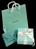 |
Top: Lowell cites Restoration Hardware as a good example of color usage. Bottom: Tiffany's blue and white are instatnly recognizable — the retailer owns the two colors. |
Tiffany and Co's white and pale blue turquoise does too. It's solid andsignatory — they now own those colors.
RCE: On the other hand, can you name some retailers that you believe have made unfortunate color palette choices?
Lowell: For me, it's not that they made bad choices at the time, but that consumers' visual language has changed. "Homemade" had a different country-style motif than it does today. Today "homemade" has shifted to "gourmet." For many, that has an organic-chic look, where homemade had more heartland imagery that does not play as well today.
"Hip and trendy" has also changed. When Starbucks opened with its blond woods; hanging, jewel-toned pendent lighting and overstuffed velvet furniture, it was hot. But with the advent of the boutique hotel craze, it has educated the consumer to more global sophistication, and Starbucks is now looking a bit dated — especially when every other coffee chain knocked them off so early in the game. So it's lost the authenticity it once had.
James Bickers is senior editor of Retail Customer Experience magazine and online.
About James Bickers

Related Media
Subscribe
Get the latest news and resources from Retail Customer Experience.
Recent Posts

Minnesota lawmakers mulling surveillance pricing ban

VenHub ranks in top 10 on most innovative companies list

Toshiba leader talks mobile device innovations, retail customer experience tech
CVS Health debuts apothecary-style pharmacy locations

Real estate firm taps eyefactive for interactive touchscreen
