Article
Mobile Monday: Abercrombie & Fitch app
The A&F iOS app comes up short in a critical area: Actually selling product.
February 6, 2011
 ChatGPT
 Grok
Grok Perplexity
 Claude
Welcome to Mobile Monday, a weekly column by customer experience expert Mike Wittenstein, focused on mobile apps in retail. Each Monday, you'll get a customer's-eye view of smart phones, tablets, and occasionally behind-the-scenes technology.
Last week, we reviewed the Apple Store app. It offers an excellent customer experience because of its breakthrough approach, well-organized content, usefulness, and built-in buying ability.
This week, we review the Abercrombie & Fitch app. A&F is a fashion-forward, well-defined niche youth brand with long-lasting connections to its core customer. In traditional media, A&F uses visual media superbly, creating a consistent cross-channel image.
Quick Summary
This A&F app is all about viewing and nothing about doing. It fails to provide real value for its audience or offer anything unique. This app is none of the things (yet) that the Apple Store app is. At best, it's a late-to-market also-ran, offering practically no convenience, utility or merchandising value.
From an aesthetic perspective, the photography is fabulous, but the photographer's lens seems to have missed the merchandise, focusing instead on the human mannequins. Perhaps that's why downloading the app carries an “Are you 17?” warning.
Learning Objective
If it's not already obvious, this is going to be a negative review. The point is not to bash A&F. They're a great brand with a continuously regenerating youth market (one of the hardest segments in the retail business to capture and hold). The point is to learn, as a community, how to best meet customers' needs. I expect A&F's apps will soon come up to par with their already established brands and, perhaps, teach this reviewer a thing or two.
In the meantime, think about your own retail operation and see what you can learn to do--or not do--as we review this A&F app in detail.
Review
The A&F App opens to a black and white screen with five options, only two of which are visible without scrolling.
 If you want to see What's New, it takes two clicks to get to the first item. First the application takes you here ...

Then, after making a choice by gender, you get right to the merchandise. But, it might not be what you're looking for.

The photographs are beautiful, yet hard to appreciate because there's little contrast between the clothes and the background.
From here, shoppers can swipe a finger on the screen to see the next item, go back, or buy...
Selecting the Shop A&F option jumps you completely out of the app to the web store. Here, the interface is hard to use and the context (where users came from) is lost.

Back to the main page. A&F on Facebook shows A&F's Facebook page. Well, kind of. As of this writing, Apple is still arguing with Adobe and others about what image types you can and can't see on iPhones, so A&F presents a naked page.

The A&F Gallery delivers on its promise--presenting a beautiful gallery of photos. This part of the app doesn't highlight the clothes A&F sells.

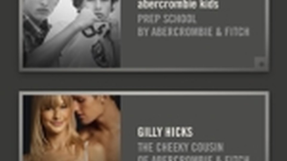
A&F Family introduces users to the family of A&F brands. Each gets a single-page landing pages and link to the website. This is effective for teaching customers that A&F owns other brands they might be interested in. More stores could follow A&F's lead here. It's always preferable to cannibalize your own customers than let another brand do it for you.

The Store Locator option shows you where you can find an A&F store nearby. The app presents this information in a branded frame (an industry best practice) so that users can get back to other parts of the application without restarting it.
 What's Good
- A&F extended the use of its well-known brand assets to mobile
- A&F regularly updates the content
- A&F used frames to present external content keeping customers longer
What's Not So Good
- App content is skewed to brand managers, not customers
- App offers very little to engage, inform, assist, or guide customers. It doesn't "do" anything.
- App doesn't offer merchandising, personalization, promotions or social features
Related Media
Subscribe
Get the latest news and resources from Retail Customer Experience.