Article
Mobile Monday: Bebe app
The Bebe app offers just about everything a customer would want, but can be difficult to navigate.
February 13, 2011
 ChatGPT
 Grok
Grok Perplexity
 Claude
Welcome to Mobile Monday, a weekly column by customer experience expert Mike Wittenstein, focused on mobile apps in retail. Each Monday, you'll get a customer's-eye view of smart phones, tablets, and occasionally behind-the-scenes technology.
Last week, we reviewed the Abercrombie & Fitch App. It offered great brand visuals, but little in the way of merchandising options.
This week, we review the Bebe app. Bebe designs and develops in-house a distinctive line of women’s apparel and accessories aimed at 21- to 35-year-old women seeking current fashion. Vertically well integrated, Bebe markets separates and accessories through 200 stores, online and now through mobile apps.
Quick Summary
The Bebe app offers just about everything anyone would want — the only problem is the difficulty in getting to it. The app is functional and presents products well, but at the expense of the brand experience.
Opportunity
Bebe has introduced a highly functional app with tremendous merchandising opportunities. The company obviously understands its customers extremely well from a fashion perspective.
With relatively flat stock performance ($5-$10 for almost two years, down from $26 in 2006), the brand needs a boost. Perhaps if Bebe studies its customers’ lifestyle and service needs in addition to their fashion needs, then applies what they learn to convenience, shopper experience and value creation, they can wow both their customers and their shareholders.
Review
At the iPhone App Store, the Bebe App promises you can do it all. It delivers!

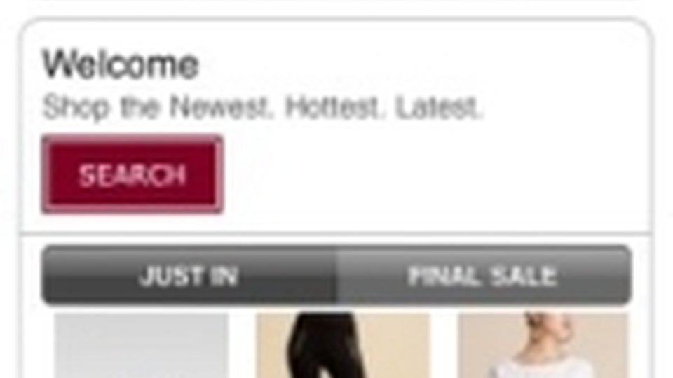
The Home Screen is simple and matches the style of Bebe’s web-based store.

Searching is available for surgical shoppers and is intuitive.

Just browsing? It looks easy, but it takes 3-5 additional clicks just to see the products. Granted, Bebe offers multiple categories of items (tops, sweaters, dresses, active wear, and accessories), but users have to make so many choices it can be frustrating. For example, let’s say the target is a blouse...
1. Click on Browse by Category

2. Click on Apparel

3. Click on Tops

4. Swipe up and down, then click on Floral Printed Silk Bustier. Then, click on the picture to see a larger image. Bebe does a really nice job here of letting a busy woman on the go check out multiple views.


5. Touch the smaller images beneath the bigger one to see the back...

or the side...

6. Ready to buy, go back then touch Add to Cart. The image of the item duplicates on screen then shrinks and falls right into the shopping cart. Very Apple-like and very intuitive.

A red circle with the number 1 (for one item so far) sits atop the cart as a reminder for the user.

7. Ready to buy now? Touch the Cart icon at the bottom of the screen to get started.

8. If the shopper is a returning customer, she gets through the process quickly.

9. If not, there are several more screens to go through ... more than this reviewer has the patience to report.

What’s Good
- Highly functional
- Good merchandising
- Models show clothing items from all angles
What’s Not So Good
- Lacks the appeal of the brick-and-mortar experience
- Value-added features are absent
- Cumbersome interface
What I Would Do
Bebe needs to add features that add value to their customer’s lifestyle, not just to their wardrobe. How about:
- Clicking on an item to have it pulled and ready for you when you stop by in person at any store
- Letting shoppers compare their previously-purchased Bebe items in a virtual wardrobe to see what matches
- Creating an interactive version of the Look Book (available on the web site) and tying it to a recommendation engine
- Giving shoppers the option to email an outfit to a friend for feedback
Related Media
Subscribe
Get the latest news and resources from Retail Customer Experience.
Recent Posts