News
Less is more
A minimalist approach to retail design sets the stage for a full brand experience.
May 14, 2008
 ChatGPT
 Grok
Grok Perplexity
 Claude
This article originally published in Retail Customer Experience magazine, May-June 2008. Click here to download a free PDF version.
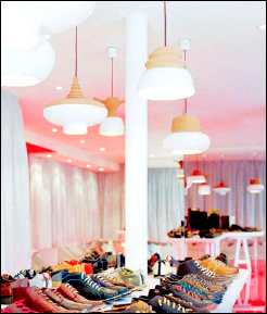 |
| Spanish shoe maker Camper has translated its brand into a synonym for style, specifically, minimalist style. Each Camper store is unique. The |
The term "minimalism" sometimes is applied to stores that have merchandise on racks without decoration or embellishment. There's not a potted plant in sight, no oak-panel shelving, just rows and rows of stuff. But that's typically a design choice based on cost-per-square-foot efficiency, not aesthetics.
Luxury goods stores often use the van der Rohe-influenced minimalist design aesthetic, what Craig Hale, architect and national director of retail stores for Jacobs Carter Burgess, calls "museum minimalist."
"The benefit of this style of minimalism is that it showcases the brand and celebrates individual pieces or small groupings of merchandise," Hale said. "This style capitalizes heavily on the aesthetic and artistic beauty of minimalism to promote the product."
Minimalism is not always spare, stark design. It does, however, give a store a distinctive presence. Eduardo Braniff, global insight director for The Imagination Group, a brand and retail design consultancy, points to the Prada store in Tokyo as a minimal design "that is at the same time this extraordinarily compelling architectural gesture."
The Tokyo store is an unconventional six-story glass crystal with five sides that feel soft despite the sharp angles. The glass is a curtain enclosing structural cores that form elevators, stairs, fitting rooms and display shelves that integrate the shopping space into the architecture.
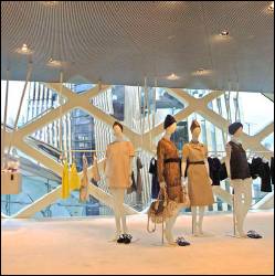 |
| Inside the Prada store, fixtures, lighting and display seem to be extensions of the building, imitating the architecture's blend of grace and efficiency. |
Of course, Apple stores are the current poster child for minimalism, often heralded for their bare floors, simple tables and interactive, please-touch-the-merchandise displays.
"You need to decide who the customer is you are trying to attract," she said.
"People quickly make assumptions based on your design, about what your product is all about, what kind of quality it is and what price range it will be. By using that type of design, you're already clearly targeting your market."
And customers do judge a book by its cover. In a minimalist clothing store, for instance, shoppers intuitively know that prices will probably be higher. "As soon as you have a lot of empty space, people start assuming the item on the shelf has to be priced higher to afford the space," McIntosh said.
Beware the bandwagon
Retailers have to resist the temptation to follow the latest design fad, whether it'sminimalism or something else. In working with retail design clients, Braniff relies on the brand to guide design decisions, rather than letting the design tail wag the brand identity dog.
"If the brand itself is something that when expressed physically is best expressed minimally, then that's the road we take our designs down," Braniff said.
Unfortunately, Apple's success with a minimalist approach has attracted imitators who don't have Steve Jobs' gift for ruthless execution. Braniff points to the glut of minimalist design in the wireless industry. Cell phone makers and service providers have adopted a spare look, open floor plan, white walls and a signature color. Products are laid out for interaction, but the connection to the brand suffers.
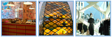 |
(left to right) A product array at a Camper store in Barcelona. The Prada store in Tokyo is the height of minimalist style, beginning with the building itself and working in. |
"Camper stores don't feel minimal when you walk in, but they actually are," Braniff said. "You can have a minimal infrastructure and minimal cues — whether it's architectural, digital or even lighting — and still have an experience that doesn't read as minimal in the way that most people think when they hear that word."
Belstaff, an iconic British brand of rugged outerwear, designed a minimalist store for its flagship London location. There, the very high-end coats and gear for mountain climbers and adventurous motorcyclists is all the decor that's needed. The clothes are accessible, creating engagement with a product that represents a serious investment in style and durability.
"It's about the roughness and readiness of that brand," Braniff said. "It's extraordinarily expensive, but it's more about you in the garment than it is about you in the store in the garment."
Time is money
One often-heard criticism of a minimalist approach is that, with less merchandise on the floor and fewer opportunities to engage, shoppers will spend less time than average in a store. If the shopper is in the market for a sweater, and only two styles are in cashmere, he may try on one or both and then leave.
A store with more merchandise and points of interaction will cause a shopper to linger longer, increasing the opportunity for an impulse purchase.
"Does a retailer have enough merchandise for shoppers to really explore and get involved with the product, or do shoppers feel like they can walk in and take a quick look around and feel like they have absorbed everything and walk back out?" McIntosh asked. "You want to involve people with your merchandise."
Heather Long, owner of Catch 22, a clothing boutique in Raleigh, N.C., designed her store in backlash to minimalist women's apparel stores that dominated the local malls.
"All the boutiques are very expensive, very minimalist designed. When you walk in, you feel very cold and very uncomfortable," she said. "I wanted to do the opposite; I wanted a boutique-style store that's comfortable to shop in."
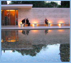 |
The Barcelona Pavilion, designed by van der Rohe for the 1929 International Exposition in Barcelona, Spain, is known for its simple form and extravagant materials. This intersection of simplicity and quality is the hallmark of minimalist style. |
With vintage furniture as fixtures, including a turquoise-and-gold clawfoot table, Catch 22 invites shoppers to linger and touch the clothes, some of which Long designs herself. A sitting area creates a cozy atmosphere that encourages shoppers to spend more time in the store.
"The better customers feel in your store, the longer they're going to stay. They'll come back more often and will buy more," Long said.
Store designs at either extreme can help shoppers select whether a retailer's brand appeals to them. It's not a bad thing to let design communicate brand position so that shoppers who don't like what a retailer has to offer simply never enter the store.
"If your target market is one where people feel like they're going to find a treasure, like an antique shop, that has a certain charm to it," McIntosh said. "That store is definitely not marketing to everyone. It's a case where you're going to be automatically, through the design of your store, keeping certain people out."
Make the switch
Retailers contemplating a minimalist design should think twice about drastically changing their current brand image. It could confuse the current customer base and may fail to attract a new following.
"Any time you're trying to do a switch, you need to be really careful," McIntosh said. "Are you going to lose the people you already have? It's less expensive to keep those customers than go out and attract a new group."
If there's an attractive target market that doesn't seem to be part of an existing customer base, then it may be more effective to launch a second store to reach that group.
"Make sure you know you have a target market there," McIntosh said. "Rather than switch your current image, it's safer to start some kind of new brand."
Gary Wollenhaupt is a freelance writer and a regular contributor to this magazine.
Related Media
Subscribe
Get the latest news and resources from Retail Customer Experience.