Article
Retail Customer Experience Executive Summit: Microsoft vs Apple
Attendees toured the Mall of America and weighed in on Apple's and Microsoft's customer experiences.
August 7, 2011
 ChatGPT
 Grok
Grok Perplexity
 Claude
Attendees of the second annual Retail Customer Experience Executive Summit had a rare opportunity to compare Microsoft's and Apple's retail customer experiences as they toured Mall of America, one of the world's largest shopping venues. On the first floor of the gargantuan facility, along one of its busiest thoroughfares, the two computer rivals go quite literally face to face. Here's what the retailers and consultants discovered.
Similarities
Both store designs were open, offering customers plenty of space in which to wander. They also used simple furniture and displays that invite shoppers to test products. Storyminers' Mike Wittenstein, who led the group, pointed out that both stores featured large glass windows that give shoppers an expansive view of the products inside.
Abundant Microsoft and Apple employees covered the floors, offering assistance and helping demo the products.
Differences
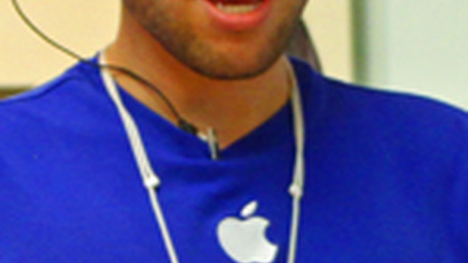
Apple's iconic logo was prominently displayed on the storefront, while Microsoft took a subtle approach, with small engravings of its less-recognizable logo across the windows.
The difference in branding promince also showed in the attire of the employees. While Apple's crew wore shirts with logos, team Microsoft's uniform consisted of brightly colored T-shirts with no branding.
"It was hard at first to a figure out who the employees actually were," said Steve Winter of Newfoundland Labrador Liquor, one of the tour attendees. "It wasn't as obvious as Apple."
Another major difference was in the amount of product info available and how it was delivered. Apple had tethered iPads to nearly every demo product, giving shoppers an interactive informational experience. In addtion, shoppers could use a "specialist" button to call for immediate one-on-one interaction from a sales associate. The strategy was a hit with attendees.
"That was just so impressive; that was a big win," said Paul Flanigan with Rise Vision.
Microsoft eschewed the high-tech approach in favor of old-school printed boards affixed next to the products — not a hit with the group.
Sales media not withstanding, the Microsoft store did receive praise for its customer attention.
"As soon as I walked in, someone addressed me and offered assistance," said David Gilman with Vision Essentials. "That was great. It's all about direct, immediate responses."
Who was the winner?
Call it a tie. Kristi Behr of AT&T called the Apple store more modern and attractive, and also said it offered a better overall customer experience. Wittenstein, however, liked how Microsoft had positioned many of its products in real-use settings, such as a mock living-room with soft couches and arm chairs where shoppers could play Xbox dance games. The store placed its Surface interactive touchscreen among bar chairs to simulate a restaurant experience.

But whether they were Apple or Microsoft fans, several attendees believed the close proximity of the two stores would hurt sales for both. Not so, said Rob Simms of Newfoundland Labrador.
"It's like Burger King and McDonald's. They're always in the same markets, and they just drive traffic to each other. You go where it makes the most sense to go."
Related Media
Subscribe
Get the latest news and resources from Retail Customer Experience.